Well, check out that blank canvas. I know some of you are thinking that that is the best polar bear in a snow blizzard you have ever seen but others of you are scratching your heads thinking you just don't see it. As much as I love the polar bear blizzard, I had other plans for that canvas. I had seen this idea on pinterest (where else?)

Basically you put vinyl on a canvas or board - whatever fits your fancy - then paint over the letters. After the paint dries, you just peel off the vinyl and that's all there is. The letters are the original color and the background is a the different color. Instead of stenciling, which let's just face it, takes forever, you get a different look.
So with my Silhouette printer, I was able to do this project. An easy and awesome project. The first step of well picking the verse but after that is chosen I could start working on picking the size and the type of font I wanted to use. I actually ended up buying this font from the Silhouette store that had a bit more character with holes in the letters and just some imperfections.
I put two coats of paint on the canvas. I just used a craft paint so it dried super fast. So it didn't take long to wait for the first coat to dry. I didn't put the first coat on very heavy and you could see the lines through the first coat. So I when I did the second coat I put it on much heavier.
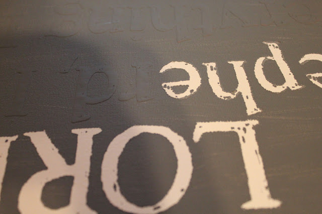
After the second coat dried, I could finally start peeling off the letters. I used this hook that I got with the Silhouette to help peel off the letters. I didn't want to chip the paint by trying to pick at it with my fingers. And the hook worked beautifully.
You can already start seeing the imperfections in my letters, which I love how they turned out actually. Which also helps with the mistakes I did make because they are less noticeable. Peeling the letters off might have taken the longest, truthfully. You had to be careful not to accidentally chip any of the paint or put a hole in the canvas with the hook, but even then it took less time than you might think a project that turns out to look like this would take.
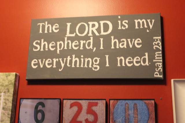
And then before I knew it, the letters were peeled off and I had this. The letters aren't perfectly lined up. There are mistakes in the paint. But to me, it turned out perfect. It has personality.
And up on the wall, the contrast between the red walls, the gray paint, and the white letters looks sharp. I also think it turned out pretty well for my first try at it. Normally my first try at DIY projects don't actually go so well. But this one I am pretty proud of.


No comments:
Post a Comment